less is more

less is more

architecture

architecture

Ludwig Mies van der Rohe was a German-American architect who is widely regarded as one of the pioneers of modern architecture. He was known for his use of simple forms, clean lines, and a minimalist aesthetic that embodied the principle of “less is more.” Mies van der Rohe was particularly influential in the development of the International Style of architecture, which emerged in the early 20th century and emphasized functionality and the use of modern materials such as steel and glass.’

Some of Mies van der Rohe’s:

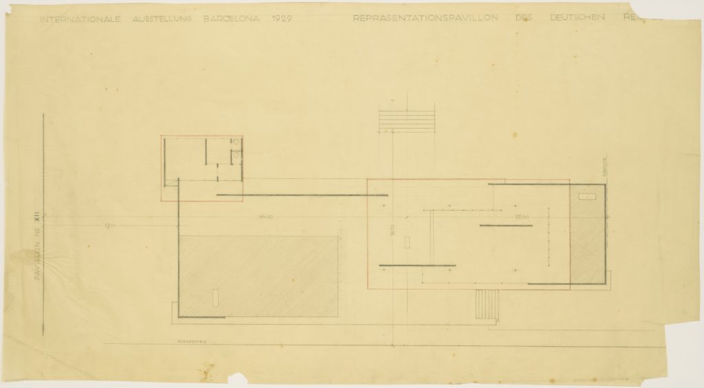
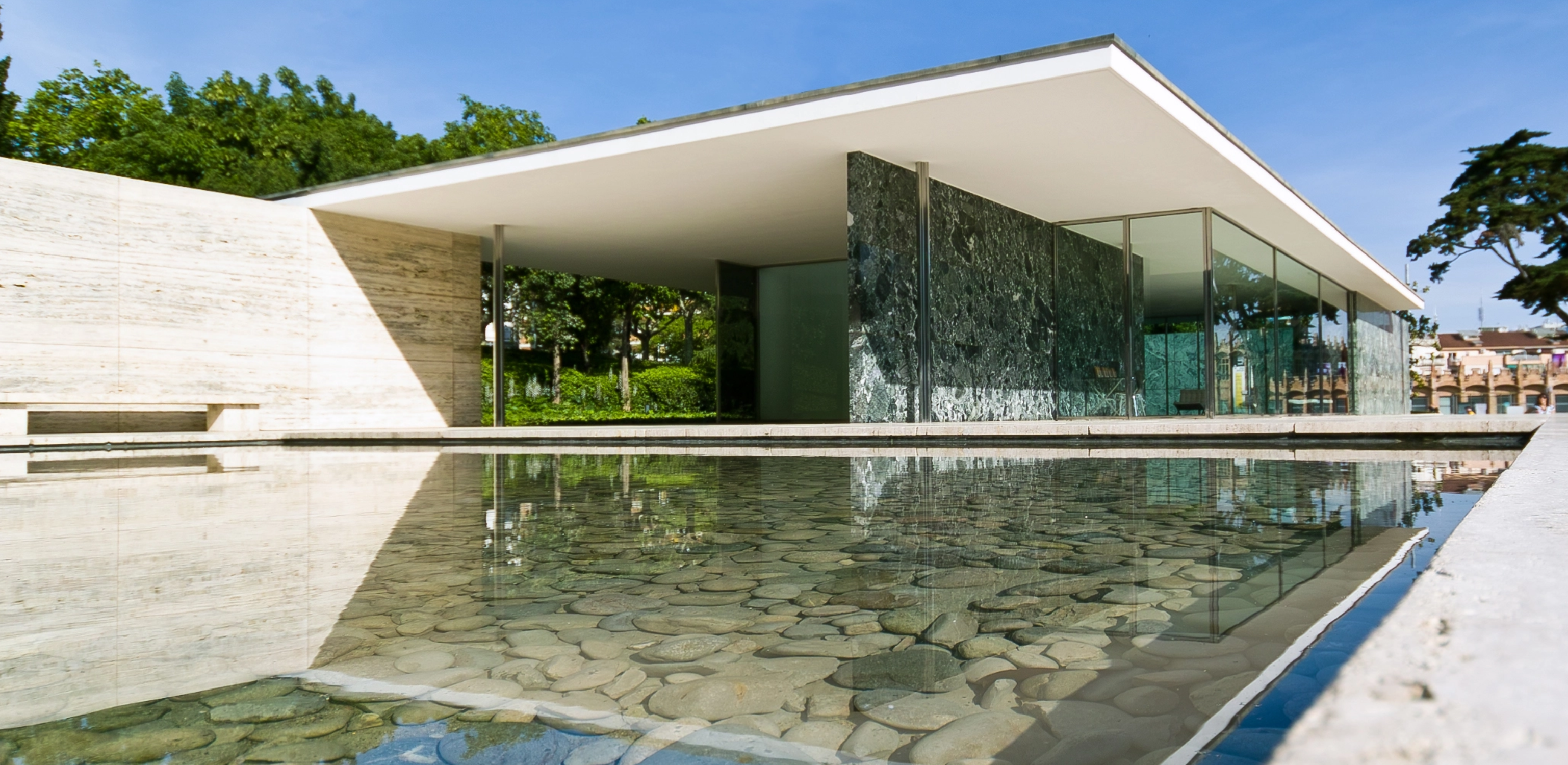
The Barcelona Pavilion: This building was designed for the 1929 International Exposition in Barcelona, Spain. It features a simple, rectangular plan with glass walls and a flat roof, and is known for its elegant use of materials, including marble, travertine, and chrome.

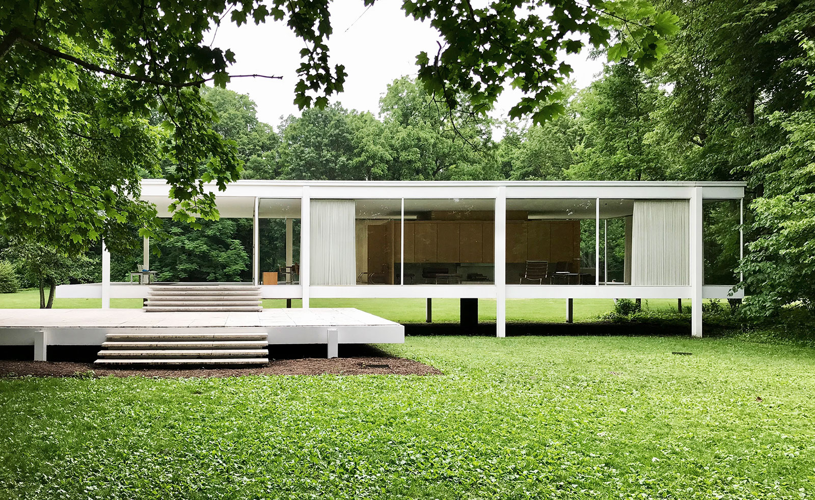
The Farnsworth House: This private residence, located in Plano, Illinois, is considered one of Mies van der Rohe’s most iconic designs. It features a minimalist steel and glass structure set on a floodplain overlooking the Fox River.

The  Seagram Building: Located in New York City, this skyscraper was designed by Mies van der Rohe in collaboration with the architect Philip Johnson. It is known for its sleek, minimalist design, which features a simple rectangular form, a bronze-tinted glass façade, and distinctive steel I-beams.

Overall, Mies van der Rohe’s architecture is characterized by its simplicity, elegance, and attention to detail. His work continues to influence modern architects today, particularly those who are interested in creating sustainable and energy-efficient buildings that prioritize functionality and user experience.

Hand drawn plans of the Barcelona Pavilion, by Mies van der Rohe

other architects

other architects

Tadao Ando

This Japanese architect is known for his use of simple geometric shapes and minimal materials such as concrete and glass. His designs emphasize the use of natural light and open spaces to create a sense of calm and tranquility.
The Pulitzer Foundation for the Arts, in St Louis, United States

Peter Zumthor

This Swiss architect is known for his minimalist designs that emphasize sensory experience and a sense of place. His buildings often feature natural materials such as wood and stone, and are designed to evoke a sense of calm and contemplation.
Thermal Baths
Screenshot 2023-04-06 132035

SANAA (Kazuyo Sejima and Ryue Nishizawa)

This Japanese architecture firm is known for their minimalist designs that emphasize lightness, transparency, and flexibility. Their buildings often feature delicate, transparent materials such as glass and metal, and are designed to integrate seamlessly with their surroundings.
New Museum of Contemporary Art

application

application

Typeface

The “less is more” movement embodies principles such as minimalism, simplicity, and functionalism. Within typography, this visually is shown through fewer typefaces, simple layouts, and very minimal color schemes. It has had a strong influence on typography, notably with the growth of modernist typography and the increased popularity of sans-serif typefaces. The Bauhaus school introduced typography and were huge advocates of sans-serif type as its simplified geometric form was felt to be more appealing and useful. 

Before the Less is More movement, serif typefaces, the more dominant in typography, where designed with small decorative flourishes at the end of each letter stroke. However, the movement’s emphasis on minimalism and legibility resulted in the increased use of sans-serif typefaces. Which are known for having clean and simple lines without the added decorative elements.

gif 3

Helvetica by Max Miedinger: 

Helvetica, designed by Max Miedinger in 1957 has been one of the most significant typefaces to emerge from the “Less is More” movement. Helvetica’s design is based on a simple and geometric sans-serif typeface with clean lines and proportional balance. The typeface is highly legible and versatile earning it’s place as one of the most popular typefaces in the design community, particularly for those wanting something versatile and timeless.

Helvetica’s popularity flourished in the 1960s and 1970s, when the “Less is More” movement was at its peak. Designers embraced the typeface due to its simplicity and functionality, utilizing it in a range of applications, everything from corporate branding to advertising and even film titles. Its boost in popularity during this period was a reflection of the movement’s impact on design.

Futura: by Paul Renner: 

Futura a typeface designed by Paul Renner in 1927, like Helvetica, was a sans-serif typeface that accentuates simplicity, clarity, and functionality. Known for its geometric and modern structure.

Futura was designed during a time of great transformation and innovation in the area of design. The “Less is More” movement was just starting to emerge, and designers had begun investigating new ways to simplify and streamline their work. Renner was deeply influenced by the “Less is More” principles, and his design of Futura mirrors this. Its lasting popularity is a testament to the powerful influence of simplicity and functionality in design.

gif 4

Furniture

Furniture design from the earlier periods was characterized by a variety of styles, ranging from ornate and highly decorative to more simplified and functional designs. Prior to Bauhaus, Art Nouveau, which emerged in the late 19th century and was characterized by its ornate and curvilinear forms. Art Nouveau furniture was often highly decorative and made use of exotic materials such as mother-of-pearl and ivory. 

The introduction of the “less is more” philosophy by the Bauhaus school, founded in 1919, marked a significant departure from earlier design movements with its focus on simplicity, functionality, and minimalism. Bauhaus designers emphasized the use of modern materials and manufacturing techniques to create furniture that was affordable and accessible to a wider audience.

wassily

Model B3 / Wassily Chair by Marcel Breuer

A classic example of the “less is more” approach in furniture design is the Model B3 or more widely known as Wassily chair, designed by Marcel Breuer in 1925 while he was the head of the cabinetmaking workshop at the Bauhaus. This studio reconceived the very essence of furniture, often seeking to dematerialize conventional forms such as chairs to their minimal existence. Breuer took inspiration from the extruded steel tubes of his ‘Adler’ bicycle, experimenting with metal furniture, ultimately creating lightweight, mass-producible metal chairs. 

The Wassily Chair features a sleek and minimalistic design, with a frame made of bent steel tubing and canvas straps that serve as the seat and backrest. Breuer took the traditional form of an overstuffed club chair and simplified it down until it was just an outline. By eliminating unnecessary elements and focusing on the essential qualities of a chair, such as comfort and functionality, Breuer was able to create a chair that remains an icon of modern design. The chair’s simple form and use of industrial materials were ground-breaking at the time, and its design has influenced countless modern chairs since its creation.

Barcelona Chair by Mies van der Rohe

The iconic “Barcelona Chair,” designed by Mies van der Rohe in 1929, is the epitome of “less is more” philosophy in furniture design. Mies designed the Barcelona Chair, in collaboration with architect Lilly Reich, for the Barcelona Pavilion.

The chair’s design is strikingly simple, consisting of only a few elements: a leather seat and backrest, a chrome-plated steel frame, and a series of straps that hold the cushions in place. The chair frame was initially designed to be bolted together, but it was redesigned in 1950 using stainless steel, allowing it to be formed from one seamless piece of metal. The design is clean, minimalist, and elegant, with every element serving a specific purpose.

Despite its simple design, the Barcelona Chair is widely regarded as a masterpiece of modern furniture design, and it continues to be a popular choice for designers and homeowners today. Its clean lines, minimalism, and use of high-quality materials make it a perfect example of the “less is more” philosophy in action, and the idea that a well-designed piece of furniture can be both functional and beautiful. 

Untitled design (2)

PRODUCT DESIGN

The “less is more” design philosophy is all about creating products that are simple, functional, and elegant, while using minimal elements to achieve the desired effect. Here are some examples of how this philosophy has been applied in product design.

AdobeStock_544732502_Editorial_Use_Only
APPLE_STOCK

Apple / iPhone

Apple Products: Apple has long been a leader of minimalist design, and its products are some of the most iconic examples of “less is more” in action. From the clean lines of the iPhone to the understated elegance of the MacBook, Apple products are known for their simple, functional designs that prioritize ease of use and user experience.

Bang & Olufsen / Beoplay speaker

Bang & Olufsen Bang & Olufsen is a Danish company that specializes in high-end audio and video equipment. The company’s products are known for their minimalist designs, which prioritize functionality and ease of use over flashy features and unnecessary details. Bang & Olufsen’s products are often considered works of art, with a focus on clean lines and simple forms.

beoplay

influence

influence

How has The “less is more” movement Influenced other design movements

The “Less is More” movement and approach to design has greatly affected various design movements. The movement values place great emphasis on the use of only essential elements, taking away the unnecessary and creating a clean look. These principles of simplicity and functionalism have influenced and are now seen across a variety of movements, including Scandinavian and Modernist design. 

building_SMALL

Modernist Movement

The Modernist movement emerged in the early 20th century, rejecting traditional ornamentation and encouraging simpler shapes and lines. Modernist design spotlighted innovation, encouraging the use of new materials and technologies. The movement is characterised by this focus on form and functionality, hence the “less is more” approach has been a perfect fit and influence on this movement.

Example: The Salk Institute: 

The Salk Institute, designed by Louis Kahn in 1965 was created as a research facility, focusing on the study of biology and genetics. The space was designed to encourage collaboration and innovation. Kahn’s work embodies the modernist architecture movement while taking a great amount of influence from the “Less is More” philosophy. 

Kahn’s design of The Salk Institute was influenced by the modernist values of functionality and minimalism. The building’s use of clean lines and materials such as steel and concrete form a feeling of simplicity. It’s use of natural light and space create a calm and relaxing environment. The “less is more” influence is also clear in the building’s minimal use of embellishment, with the emphasis placed on the beauty of the materials and form of the building itself.

Scandinavian Design

Scandinavian design became popular in the mid-20th century. Well known for its simplicity, functionality, and minimalism, the style accentuates the use of neutral colors, natural materials, and practicality. The “Less is More” movement has reinforced the values and principles central to Scandinavian design. Inspiring designers to create products that are refined and concentrate only on essential elements. The movement has motivated the pushing of boundaries in Scandinavian design.

Example: Muuto: 

In contemporary times, the “Less is More” design philosophy is seen in the work of modern Scandinavian designers such as Muuto, who creates minimalist, functional, and sustainable furniture. An example is the “Fiber Chair”. A sleek and refined chair, combining minimalist design with the use of natural materials. Those “less is more” principles radiate through in it’s design give a modern take on Scandinavian design.

chair_v2

TAKEAWAYS

TAKEAWAYS

TAKEAWAYS

Less is More?
The "less is more" philosophy can have many benefits in the field of design and in our daily lives.
1. Greater Clarity
When we eliminate unnecessary elements and focus on what is essential, we can achieve greater clarity and focus in our designs and in our lives. This can lead to greater understanding and effectiveness. (McMains & Kastner 2011)
2. Enhanced Aesthetics
Minimalist designs often have a timeless and elegant quality that can be appealing to many people. When we focus on simple, clean lines and high-quality materials, we can create designs that are both functional and beautiful. (Norman 2004)
3. Improved Functionality
When we focus on what is essential, we can often improve the functionality of our designs and our lives. By eliminating unnecessary elements, we can make designs and systems that are easier to use and more effective. (Norman 2004)
4. Reduced Waste
By focusing on what is essential, we can reduce waste and avoid unnecessary consumption of resources. This can be good for the environment and can lead to a more sustainable way of life. (Chim & Blebea 2013)
less IS more
Overall, the "less is more" philosophy can help us to simplify our lives, achieve greater clarity and focus, and create designs that are both beautiful and functional. By embracing minimalism and focusing on what is truly essential, we can achieve a more balanced and fulfilling way of life.
Previous
Next